The Art Style Evolution in Nintendo Games
27 July 2026
Nintendo games have always had a unique charm. From pixelated plumbers to sprawling cel-shaded fantasy lands, Nintendo’s visual style has constantly shifted with time. But behind those changes is a story — a creative journey that’s seen new technologies, bold artistic choices, and sometimes even divisive fan reactions.
So let’s take a stroll through memory lane and unpack the fascinating art style evolution in Nintendo games. Why has it changed so much? What does it tell us about the company? And most importantly, what’s next for Nintendo’s iconic look?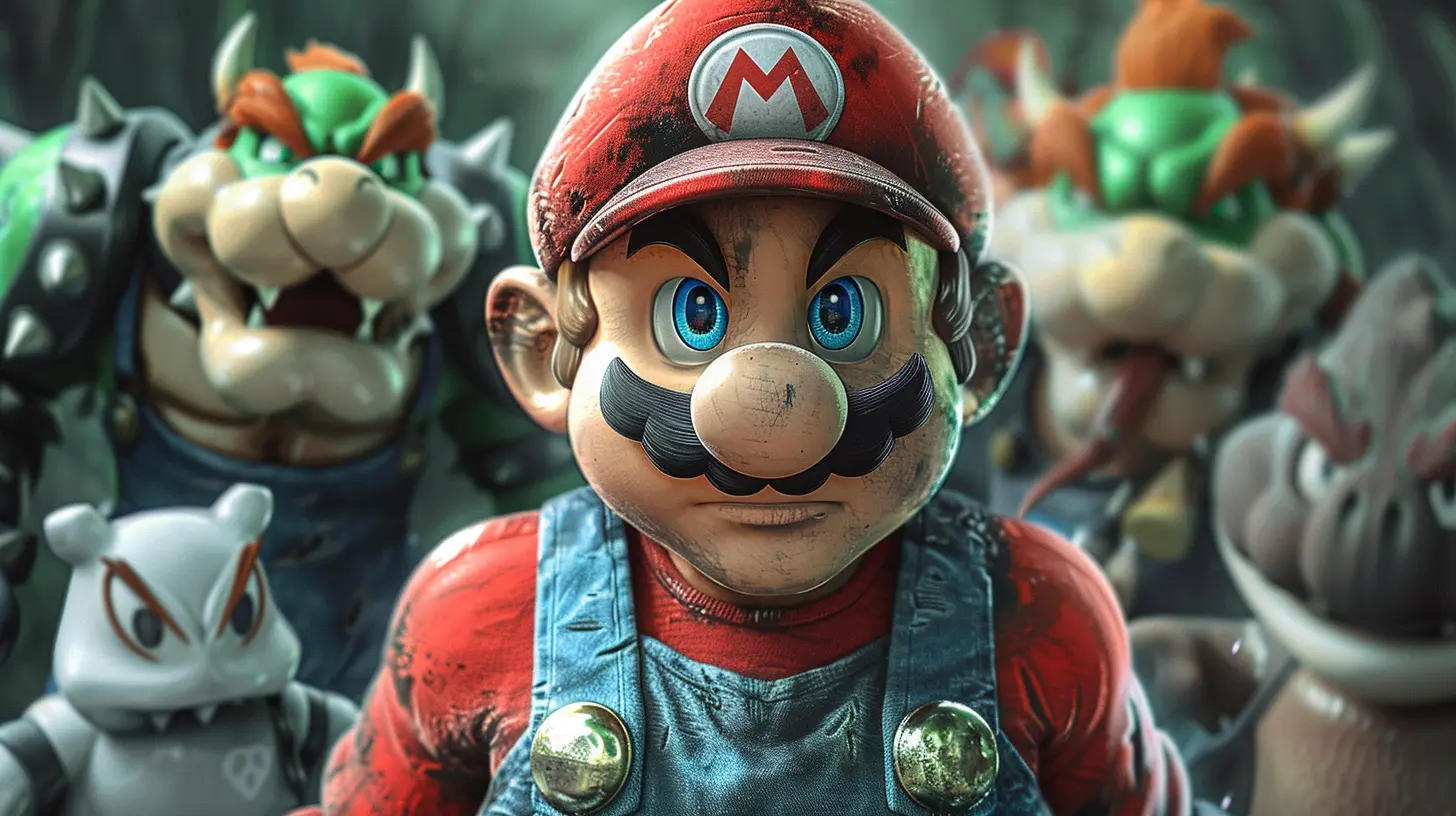
A Pixelated Beginning: The NES Era
When Nintendo launched the NES (Nintendo Entertainment System) in the 1980s, technology was… let’s say, humble. Developers had to work with very limited hardware. The result? Games made up of blocky, colorful sprites.Think of the original Super Mario Bros. — Mario was designed with a red hat and overalls for a reason. The color contrast helped him stand out. His mustache? A clever trick to avoid animating a mouth. Pretty smart, right?
These choices were less about art and more about necessity. But oddly enough, they became iconic. Those chunky pixels? They’re a whole aesthetic now.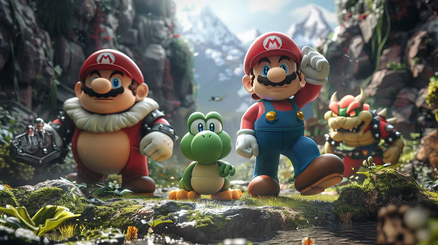
The 16-Bit Glow-Up: SNES and Artistic Freedom
With the Super Nintendo (SNES), everything changed — well, at least visually. The graphics improved dramatically. Developers had more colors to work with, better resolution, and more memory. That meant artistic creativity started blooming.Just look at The Legend of Zelda: A Link to the Past. It’s vibrant, detailed, and full of personality. Characters had more defined expressions, environments had a sense of depth, and fantasy worlds felt truly alive.
What’s interesting is that even with more power, Nintendo stuck to a cartoon-ish look. They weren’t chasing realism — they were building a style that was timeless. And that’s a pattern you’ll see throughout Nintendo’s history.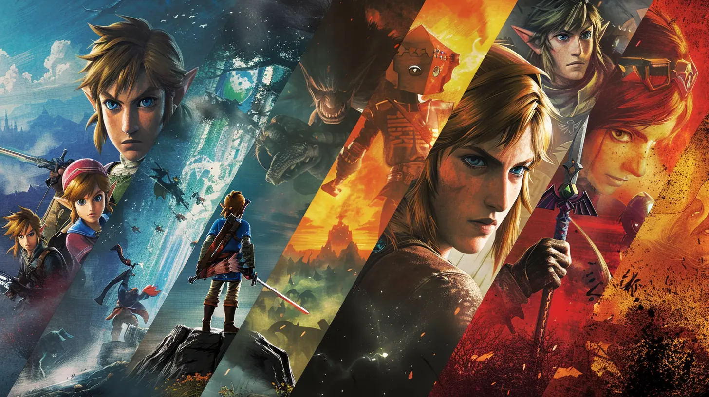
The Jump to 3D: N64 and Bold Experiments
The Nintendo 64 era was a wild ride. It brought 3D graphics to the table, and with that came a whole new wave of design challenges. Keep in mind, 3D was still pretty rough around the edges back then.Titles like Super Mario 64 and The Legend of Zelda: Ocarina of Time redefined what games could look like in a 3D space. But let’s be honest — they were kind of polygonal messes by today’s standards. Still, they had charm. And more importantly, they were revolutionary.
What stands out during this era is how Nintendo embraced the limitations. Instead of aiming for hyper-realistic visuals (which the hardware couldn’t achieve anyway), they leaned into stylized designs. It was a smart move that gave their games lasting appeal.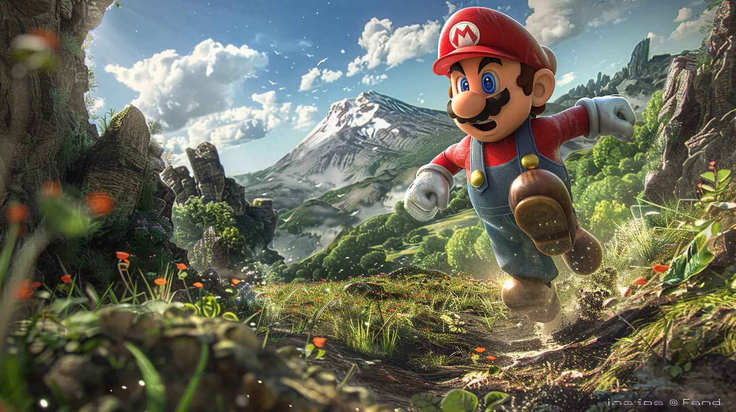
GameCube Era: Style Gets Selective
Now we’re getting into the early 2000s. The GameCube was more powerful, and developers had more tools than ever. This is when Nintendo started making really bold stylistic choices — and not everyone loved them immediately.Remember the backlash when The Legend of Zelda: The Wind Waker was announced? Fans were expecting a gritty, realistic Zelda game. What they got was a cel-shaded, cartoon-like world with big-eyed characters and exaggerated expressions.
At first, people were skeptical. But over time, Wind Waker became a fan favorite, partly because its art style aged so well. Unlike many early 3D games with janky graphics, Wind Waker still looks gorgeous today.
On the flip side, Metroid Prime went in a completely different direction — taking a darker, more atmospheric route. This contrast showcased Nintendo’s growing ability to adapt art styles to different tones and genres.
The Wii and DS Era: Simplicity Rules
With the Wii and Nintendo DS, the company made some interesting compromises. The focus was on casual gaming and accessibility, which meant the graphics couldn’t always be cutting-edge.But again, Nintendo played to their strengths. Games like Wii Sports and Animal Crossing: Wild World embraced simplistic, clean visuals that appealed to a wide audience. They weren’t winning realism awards, but they were charming and easy on the eyes.
Super Mario Galaxy deserves a special mention. Despite the Wii’s limited hardware, it looked stunning. The use of color, lighting, and imaginative worlds made it visually spectacular without needing ultra-detailed textures. It’s like Nintendo pulled off magic with a paintbrush and a calculator.
HD Arrives: Wii U and the Power of Polish
The Wii U might not have been Nintendo’s most successful console, but visually, it stepped up the game. HD graphics finally made their way to Nintendo titles, and it showed.Games like Super Mario 3D World and Donkey Kong Country: Tropical Freeze looked crisp, colorful, and full of life. But perhaps the biggest winner in terms of art was the Legend of Zelda: Breath of the Wild teaser shown during this era.
The real star here, though? Wind Waker HD. It proved that a great art style doesn’t age — it just needs a little polish to shine again. Nintendo basically said, “Told you cel-shading was a good idea,” and they were absolutely right.
Switch Magic: Where Art Styles Truly Shine
Enter the Nintendo Switch. With more power and hybrid capabilities, the Switch became a playground for artistic expression. Nintendo doubled down on unique styles rather than chasing realism.Let’s talk about Breath of the Wild. It mixed elements of cel-shading with painterly textures, creating something that felt both modern and timeless. The sweeping landscapes, subtle color palette, and minimalist UI made it feel like you were playing an interactive Studio Ghibli film.
You’ve got Super Mario Odyssey, which jumps between drastically different styles — from photorealistic cities to abstract fantasy worlds — and somehow ties it all together with charm and consistency.
Even quirky games like Splatoon brought in a bold, urban, graffiti-inspired aesthetic that screamed "fresh" and appealed to a younger, edgier crowd. Nintendo was no longer just about simplicity — it was about identity, flavor, and breaking the mold.
Indie Influence and Nintendo’s Response
It’s impossible to ignore how the rise of indie games pushed Nintendo further to innovate artistically. Titles like Hollow Knight, Cuphead, and Ori and the Blind Forest set a high bar for stunning visuals.Nintendo didn’t just adapt; they responded by upping their own game. You can see it in recent titles — Kirby and the Forgotten Land has a sweet, almost clay-like softness to it. Yoshi’s Crafted World feels like it was made in your grandma’s craft room, using felt and cardboard.
Nintendo’s modern approach seems to be: "Let’s make the art part of the world itself." That’s more than just pretty visuals — that’s visual storytelling.
Why Nintendo’s Art Style Matters
So, why does Nintendo’s evolving art style matter? It comes down to one simple truth: these games stay with us.Stylized graphics age better. They leave stronger impressions. They connect with players emotionally. And most importantly, they make games feel like Nintendo — even when everything else changes.
Nintendo has never been in a race with Sony or Microsoft when it comes to hardware muscle. Instead, they’ve built their legacy on personality, creativity, and heart. Their art styles are a key part of that story.
What’s Next for Nintendo’s Visual Identity?
With the Switch’s successor on the horizon, fans are eager to see where Nintendo goes next. Will they embrace cutting-edge visuals? Go more realistic? Stay bold and imaginative?If history’s taught us anything, it’s this: Nintendo will probably surprise us. They’ll zag when others zig. And whatever direction they choose, they’ll make sure it feels like a Nintendo game.
They’re not just creating games — they’re crafting experiences. And art is the soul of that craft.
Final Thoughts
From 8-bit pixels to lush open worlds, the art style evolution in Nintendo games is more than just a technical timeline. It’s a reflection of the company’s creativity, risk-taking, and commitment to joy.The visuals might change, the consoles might evolve, but that Nintendo "feel"? That’s forever.
So next time you boot up a new Nintendo game, take a moment to really see it. The colors, the shapes, the motion. There’s a story in every frame — and it’s one worth appreciating.
all images in this post were generated using AI tools
Category:
Nintendo GamesAuthor:

Francesca West
Discussion
rate this article
1 comments
Karson Roth
Love how Nintendo constantly reinvents its art style while keeping the magic alive. Truly inspiring!
July 31, 2026 at 3:51 PM
Francesca West
Thanks! Nintendo's ability to blend innovation with nostalgia is definitely a key part of its charm. Glad you enjoyed the article!